Adding a background image in Looker Studio is a great way to enhance your dashboard’s visual appeal and make your data storytelling more engaging. From my experience, carefully placing background images can significantly elevate a dashboard, but it's essential to ensure they don't distract from the data itself.
Step-by-Step Guide to Adding a Background Image in Looker Studio
1.Insert Image
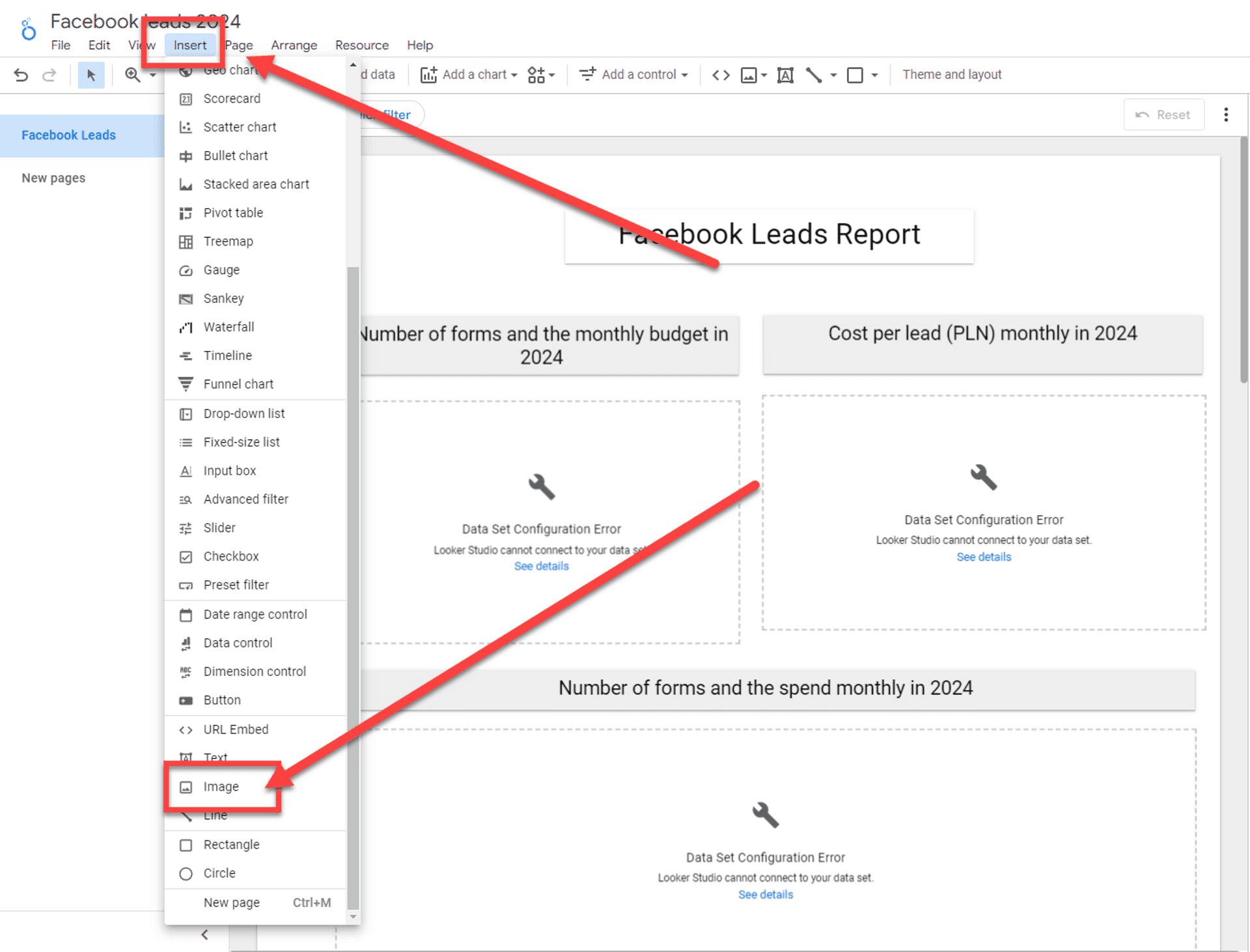
- Go to the toolbar and click on Insert.
- Select Image.

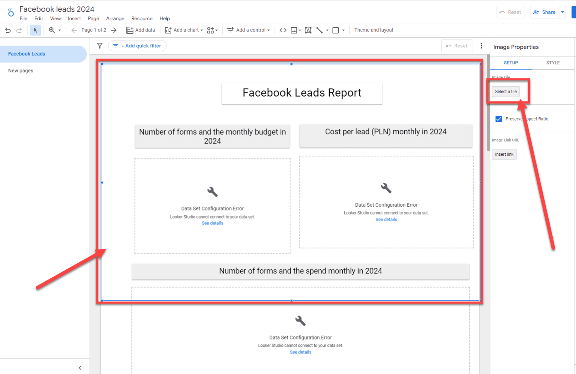
- Select space for image with rectangle shape
With the shape selected:- Click Select file under Image properties

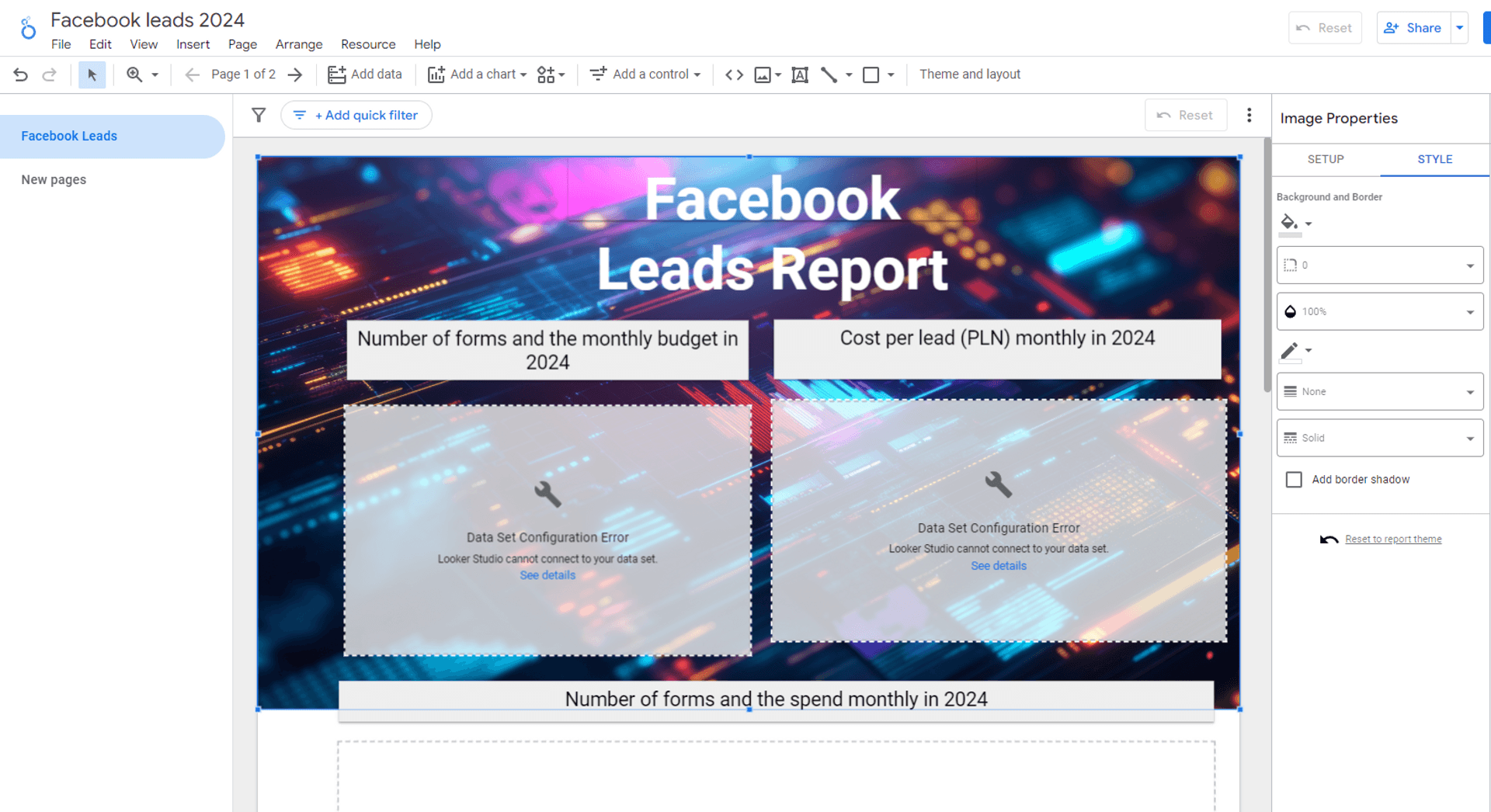
Send the Image to the Background
Once the image is in place:- Right-click on the image and choose Order → Send to Back.
- This will position the image behind all data elements like charts and tables, ensuring it serves as a background without covering any vital information.

Fine-tune the Image Transparency
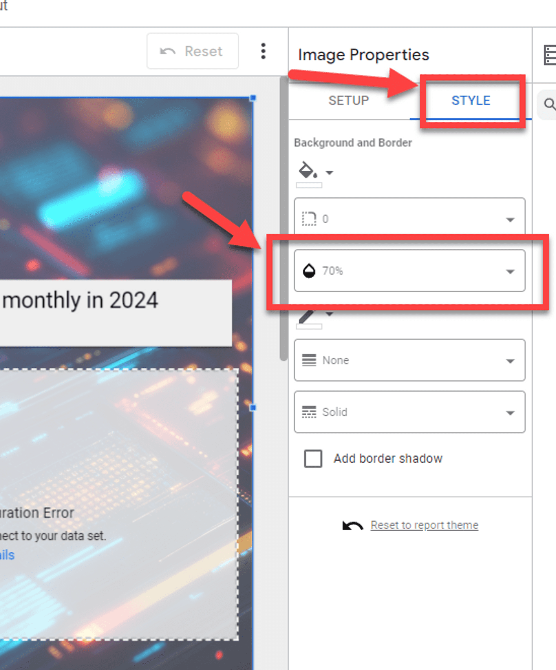
You can adjust the transparency of the image to prevent it from overwhelming the data:- Click on the image, go to the Style panel, and adjust the transparency slider.
- A transparency level of around 50-70% is often ideal to balance aesthetics with readability.

Here is a video guide, or if you prefer, you can follow the tutorial with screenshots below the video.
Best Practices for Using Background Images
When adding a background image, make sure it doesn’t distract from your core data. Opt for subtle designs or images with muted colors. Bold or bright images can make the data harder to read, which defeats the purpose of the dashboard.
For more tips on setting up your dashboard, check out my guide on How to Create a Looker Studio Dashboard, or if you’re just starting, you may find the article on How to Access Looker Studio helpful.
From my view, using background images in moderation can make your dashboard stand out without overwhelming users. Keep the focus on your data, and use images to enhance, not dominate, the narrative.
Adding a background image in Looker Studio is straightforward but should be done thoughtfully. It’s crucial to balance aesthetics with clarity, ensuring your dashboard remains easy to navigate and understand.
Published